
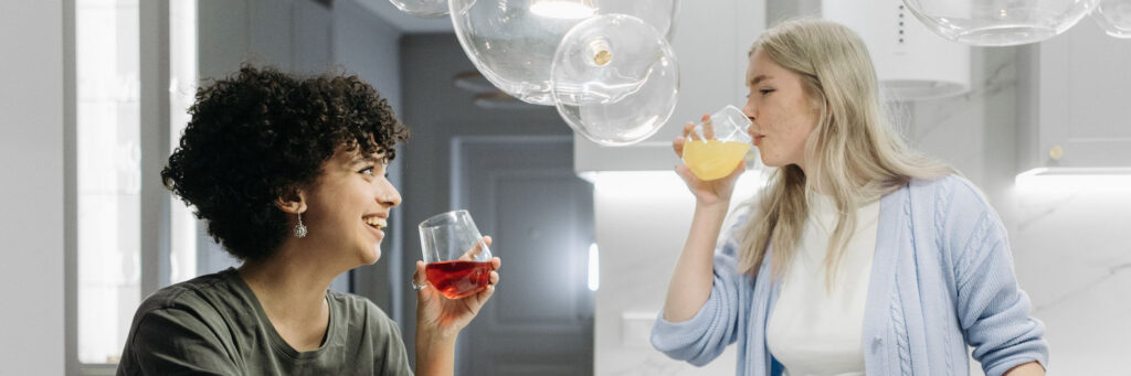

You walk into a room and something either settles or tightens. A beige waiting area flattens you. A friend’s kitchen, with its green tiles and the window open, lifts you before anyone has said a word. Most people sense the link between colour and mood long before they read anything about it, and then wonder whether they are imagining it.
You are not imagining it, though the real story is more interesting than the posters suggest. Colour does not push a button in your brain marked “calm” or “angry”. It works through light, memory, association and context. This guide explains what is actually going on, what the research supports, and what you can change at home, in your wardrobe and at work without repainting anything.
What This Guide Covers
- What Is the Link Between Colour and Mood?
- Colour Psychology vs Colour Preference: Why They Are Not the Same
- The Five Qualities of Colour That Affect How You Feel
- What the Research Says
- Signs Your Colour Environment Needs Attention
- How to Improve Colour and Mood: 8 Practices
- Colour and Mood at Work
- Common Myths About Colour and Mood
- Frequently Asked Questions
- Where to Start
What Is the Link Between Colour and Mood?
Colour and mood are linked through three routes at once: the light itself, which affects alertness and sleep timing; learned association, which ties a shade to places and people you have known; and context, which decides what a colour means in that moment. Red on a warning sign and red on a birthday table do not land the same way.
Psychologist Andrew Elliot, reviewing the field in Frontiers in Psychology, calls this colour-in-context: the same hue carries different meaning depending on where you meet it and what you are doing. So colour is a genuine influence on feeling, but an ingredient rather than a lever. It sits alongside sleep, movement, relationships and purpose in the wider picture our complete guide to wellbeing sets out.
Colour Psychology vs Colour Preference: Why They Are Not the Same
Most “colour psychology” charts are really colour preference dressed up as science. They tell you blue is calming and yellow is cheerful, as though every person carried the same wiring. Preference is personal and built from your own history: the yellow of a childhood kitchen is not the yellow of a hospital corridor.
There are some broad patterns. Lighter, less saturated colours are generally rated as calmer, and stronger, more saturated ones as more arousing. But broad patterns are averages, and you are not an average. What matters more is noticing your own reactions honestly, which is the same skill behind any useful practical work on managing your mood.
Colour also carries meaning in traditions far older than psychology, from chakra systems to the way people describe feeling “grey” or “seeing red”. If that side interests you, our vibration analysis frequency chart covers it. Treat it as lived experience and tradition, not measured physics.

The Five Qualities of Colour That Affect How You Feel
1. Hue
Hue is the colour name: red, blue, green, ochre. It carries the strongest associations and the weakest consistent effects. Hue matters most where you already have a personal history with it, which is why one person finds deep green restful and another finds it heavy.
2. Saturation
Saturation is how intense the colour is. A chalky sage and an electric lime are both green, and they do very different things to a room. High saturation across a whole wall tends to feel stimulating and hard to ignore; the same colour on a cushion reads as a lift rather than a demand.
3. Brightness and daylight
How much light reaches a surface changes everything. The same paint looks generous in a north-facing room in summer and sullen in a hallway with one bulb. Before you blame a colour, look at the light it is being asked to work with.
4. Context and association
Context decides the meaning. Red on an exam paper and red in a bowl of strawberries do not produce the same feeling in anyone. Your associations are formed by your own places, people and seasons, which is why generic advice so often misses.
5. Quantity and contrast
How much of a colour you see, and what it sits next to, often matters more than the colour itself. A room with no contrast at all can feel flat and slightly deadening. A room with too much competing contrast can leave you unable to settle anywhere in it.
What the Research Says
The best-supported findings are about light rather than paint. Harvard Health Publishing summarises the evidence that blue-wavelength light in the evening suppresses melatonin and shifts the body clock later, which affects sleep and, in turn, how you feel the next day. That is the clearest colour-and-mood link we have.
On hue itself, Elliot and Markus Maier’s colour-in-context work found reasonably consistent effects for red in achievement settings, where it can signal failure and slightly impair performance, and in attraction settings, where it does something quite different. The effects are real but modest, and they depend heavily on situation.
Daylight exposure also has solid support. Healthdirect Australia notes that reduced light in winter is associated with low mood for some people, and recommends talking to a doctor if the pattern repeats each year. That is a medical conversation, not a decorating one.
Signs Your Colour Environment Needs Attention
- You feel noticeably flatter at home than you do when you are out, and you cannot say why.
- There is a room you avoid, or work in with the door open, without having decided to.
- Overhead lighting leaves you headachy or gritty-eyed by mid-afternoon.
- Your wardrobe has quietly become all dark neutrals, chosen to disappear rather than because you like them.
- You keep bright screens and overhead lights going right up until you get into bed.
- Your mood drops predictably as the days shorten, and lifts again in spring.
- The places you feel best in have something in common that your own home does not.
None of these is a diagnosis, and no wall colour treats anxiety or depression. If low mood has lasted beyond a few weeks, or it returns every winter, see your GP. Colour is a useful adjustment to the conditions you live in, not a substitute for care.
How to Improve Colour and Mood: 8 Practices
- Fix the light before the paint. Open the blind fully, clean the window, move the desk closer to it. Most rooms that feel wrong are underlit rather than badly coloured, and daylight is free.
- Get outside early. Twenty minutes of morning daylight does more for alertness and sleep timing than any indoor lighting scheme. Walk to the shop rather than driving.
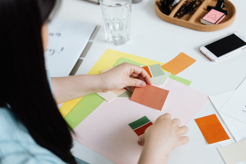
- Change one small surface. A throw, a tea towel, a pot of something flowering. Live with it for a fortnight and notice whether you look at it with pleasure or stop seeing it entirely.
- Dress for the day you have. Not the colour someone says is powerful, but the one that makes you stand slightly differently when you catch yourself in a window. This is the same kindness at work in seeing yourself with more love.
- Warm and dim the last hour. Lamps instead of overheads, screens down, lights low. Pair it with something slow, such as the exercises in our guide to breathwork for stress and anxiety.
- Keep one low-stimulation corner. One place with soft contrast, no screen and nothing unfinished in view. A single chair by a window is enough.
- Bring in living colour. Plants, herbs on the sill, vegetables that are not beige. Colour on the plate is also a reasonable rule of thumb for eating well, and it sits alongside the other ways you feed your soul.
- Keep a one-week colour log. Note where you felt best each day and what the light and colour were doing there. Your own data beats any chart.
Colour and Mood at Work
Most offices are decided by someone else, and the grey carpet is not yours to change. What you usually can change is where you sit relative to the window, whether the overhead light above your desk is the only one on, and whether there is a single object on the desk you actually like looking at.
Be honest about proportion, though. A dim room contributes to a flat afternoon; it does not create chronic exhaustion. If you are running on empty by Wednesday, the cause is far more likely to be workload, unclear roles or poor support, which is where our guide on how to avoid burnout is more use than a lamp.
For managers, light and outlook belong in the same conversation as workload and psychological safety. People who sit all day under harsh lighting with no view notice it, and it shapes how the place feels. Our post on why your team’s mental health is your business covers the larger piece.

Common Myths About Colour and Mood
Blue calms everyone and red angers everyone. Neither holds up. Effects depend on saturation, quantity, setting and your own associations. A deep blue room can feel cold and closed in; red on a jumper can feel warm and confident.
Painting a room will change how you feel for good. New colour gives you a noticeable lift for a few weeks, then becomes the background. The lasting gains come from light, daylight exposure and sleep, not the tin.
Neutral rooms are always the safe choice. Low contrast and no colour at all can feel deadening rather than restful, particularly in a room with little daylight. Safe is not the same as good for you.
Your favourite colour reveals your personality. It mostly reveals what you have liked looking at, and where you have been happy. That is interesting, and it is still worth using, but it is not a personality test.
Frequently Asked Questions
Is the link between colour and mood real or a placebo?
Both are involved, and that is fine. Light genuinely affects alertness and sleep. Hue works largely through meaning and association, so expecting a colour to lift you is part of why it does.
What colour should I paint a bedroom?
Something softer and less saturated, in a shade you like, with lighting you can dim at night. The evening light matters more than the paint, so start there before you choose a tin.
Can wearing brighter clothes change how I feel?
Often, yes, in a small way. Clothes change how you carry yourself and how people respond to you, and both feed back into your mood. Wear what you actually like, not what a chart prescribes.
Can colour help with depression?
No. Light exposure and pleasant surroundings can support how you feel day to day, but they do not treat a condition. If low mood has persisted for weeks, speak to your GP or a psychologist.
Where to Start
Pick one room you spend real time in and give it more daylight this week. Open the blind fully, move the chair towards the window, clear whatever is blocking the light. Nothing bought, nothing painted.
Then leave it a fortnight before you judge it. Mood moves around for a dozen reasons, so one bright Tuesday proves nothing. Two weeks is long enough to see a pattern, and short enough that you will remember to look.
Colour and mood are quietly connected, not dramatically so, and the honest version is more useful than the chart version: better light, a few things you genuinely like looking at, and attention to how you actually respond.